I Tested Out Microsoft Designer
I got access to Microsoft Designer, so you know, I had to jump in and test it right away.
After I tested out the AI writing tool Rytr, and with the rise of chat GPT and other AI text and illustration based tools in the popular LinkedIn discourse, I’ve been really curious about if any of these are going to get to the point where they are similar to human creative work. Why this is also of particular interest to me is that I used to work as a graphic designer. It was at a small scale, creating advertisements for events at my 3,000 student college campus, but I did for time make money doing graphic design.
My experience with these AI generation image tools is pretty limited. I can’t remember the specific one that we tested out at my old job, but we basically joked around by inputting silly prompts to see what kind of crazy stuff it could come up with. For example, I told it to generate images of a punk rock band playing a show in space. The results were pretty horrifying, because it could not figure out faces.
But, I figure it’s probably time to try to use one of these for real, so let’s get back to my review of Microsoft’s new tool.
Using Microsoft Designer
To kick the tires a bit, I thought I would give it some prompts that have come up in my day job. I wanted to see if something like this would be a viable solution to solving our imagery needs.
The first prompt I gave it was to create a blog header image showing the concept of financial literacy. What it generated first were some pretty basic images that all said “financial literacy” and had some financial or money related image, like coins or a stock chart. These definitely are giving Canva template vibes. That’s not exactly a bad thing, though it feels a little bit generic. But, I will say it’s a step up from just downloading a basic stock photo and doing nothing with it. What is pretty neat is that some of them were actually animations, which I was not expecting.

From the options, you can go ahead and customize the results. I chose one of the still images to test. In the editor, you can add text or visuals. You can start with a template, or generate new ideas. What’s neat is that you can actually build a brand kit within it.
You can lightly edit the images within your design by blurring the background, adding filters, or adjusting the brightness or contrast. These are similar things that the Microsoft desktop photo app already does, so If you happen to have used that in the past, it’s very intuitive.

You can also use an image in your prompt (either by uploading from the computer or getting a QR code to use your phone – cool!) I tested this out by uploading a photo I took of a hiking trail and telling it to create an Instagram story promoting how to be sustainable and save money at the same time – another blog I just wrote for my day job. Once again, I got a number of similar Canva-like templates, but the text that it chose for most of them was “sustainability and savings.” Here are the results:

I pulled one into the editor as well, and it suggested things like icons and illustrations that I could use on top of the images - called “Recommended for this design.” It showed icons of little leaves and illustrations of houses with people putting money into them, so here is where it picked up on the full prompt about sustainability and saving money. Further below it suggested things like spring icons, flower icons, and Earth day illustrations. You can also click into something called inspire me, where it will switch up the colors.

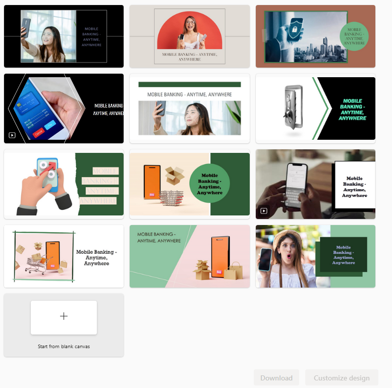
The third and final image I asked it to generate was a magazine ad for the bank I work for. This is the prompt I gave it:
“Create a magazine print ad for a mobile bank. The ad should be upbeat and appeal to people aged 25-45. Use the color navy blue, bright yellow, and green.'“
It defaulted to landscape options. It also did not use the color navy blue at all, or yellow, but picked up on the green. (Maybe because I qualified the shade for the others?) It pulled in the same line of copy: “Mobile banking – anytime, anywhere” and a variety of the same stock photos. Interestingly, for this prompt I got images of people, but also some ecommerce related imagery with a shopping cart and boxes. Kind of a miss there.
I then changed the size to portrait to compare the two. Some of the portrait ones were clearly cropped from the landscape and not optimized at all.
Landscape:
Portrait:

Microsoft Designer thoughts
Ultimately, none of these designs are going to win any awards. But I can absolutely see how a small team or individual that simply needs to bump up the volume of content could benefit from something like this. I think it’s pretty cool that I can tell it to create something about sustainable living, and it pulls in Earth Day illustrations and flower icons.
When it comes to graphic design, a lot of people don’t know how to create something, but they know how to give feedback on what they do or don’t like once they see an image.
For someone who doesn’t have a graphic design background, Microsoft Designer is the sort of thing that can actually empower them to produce something – it reduces the “where do I start?” feeling that comes with a blank canvas. It produces something for you to start off with that you can edit and refine, and it even points you in the right direction on how to refine it.
Of course, if you have a really detailed brand, any sort of drag and drop editor is not going really meet your needs. I’m not envisioning that something like Van Cleef & Arpels or Honda or Nintendo would ever find value in this tool. But, for the little clothing boutique who just wants to show off the latest dress arrivals or the local restaurant promoting weekly specials, something like Microsoft Designer could be the perfect way to generate content that’s within the brand.
We’ll have to see if it gets better as people use it – I wonder if it’ll learn as people do and don’t choose certain options (like the unoptimized portrait image options), and refines from there.
How does Microsoft Designer compare to Canva?
Canva is obviously another huge tool in the drag and drop graphic design game. So how does Microsoft Designer stack up?
Both tools as editors are simple and easy to use. They provide ways to customize the design and add in extra flair with illustrations and imagery. They make it accessible to produce visual content.
But with Canva, I find that the number of templates can be overwhelming. I’ve used Canva mostly for party invitations and I found myself spending more time scrolling through the options rather than actually designing. I do think the Canva templates have more of an artistic feel, which is why I gravitate toward them for invitations.
If you’re using Canva for commercial use, there’s always the possibility that another brand could be using the same template (though you should be customizing those things to your brand font and colors at an absolute minimum.)
So where Microsoft Designer comes in is that you’re probably getting a jump start on customizing a template, so your design is less likely to be similar to the next brand post that pops up in your follower’s feed. That is, of course, until Microsoft Designer becomes more popular!
Conclusion
I enjoyed taking this tool out for a spin, and maybe I’ll come back and use it for future personal blog imagery. I don’t think I’ll be using it for my job’s imagery needs, though. I look forward to seeing if and how Microsoft Designer improves over time!